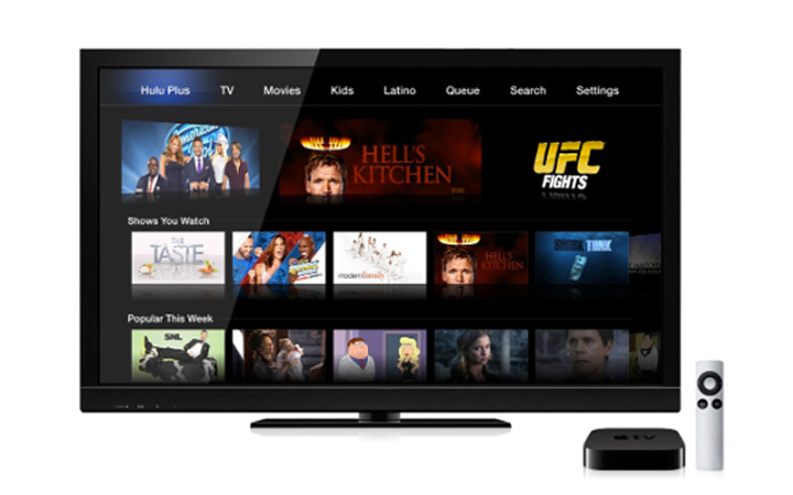
The Hulu TV app for iOS and Apple tvOS is one of the most popular apps for the movie streamers. But with the time, the Hulu app became extremely difficult to use due to the complicated navigation system and also severe glitches. After receiving tons of complaints from Apple device users, the Hulu has announced that is going to change the design of their app for iOS and tvOS. The streaming company announced the decision of redesigning the app for new functionality and the appearance at Consumer Electronic Conference 2019, Las Vegas.
Reportedly, the company will ditch the Lineup UI. The Lineup UI appears when you open the app and serves as the homepage UI on all of the platforms. As per the users, the Lineup UI is very much confusing as it contains the combination of recommended shows and editor picks. The UI is not at all simple for an average user to navigate on the iOS and tvOS. As per the streaming company, most of the users left the homepage within 30 seconds of accessing it due to complicated navigation and the choice of movies shown on the homepage.
Hulu’s Vice President of Products said that they would introduce the “HULU Picks,” which is the redesigned Editorial Picks section. In this section, the HULU staff will recommend the movies and series to the users. The other section is the Unwatched in My Stuff”, which will show the incomplete shows and movies to the users. The streaming company said that they are working on the redesign and will start testing the same within the next few weeks. As we know the testing timeline, we don’t know the exact date of the public release of these redesigned features added to the iOS and tvOS apps.
Carolyn is a technology graduate and loves to write about anything related to technology as well as writes in others sectors. Carolyn is a professional writer with over 7 years of experience. Initially starting off as a programmer, Carolyn decided to combine her knowledge about technology and writing and that’s how she joined Reporter Expert.
